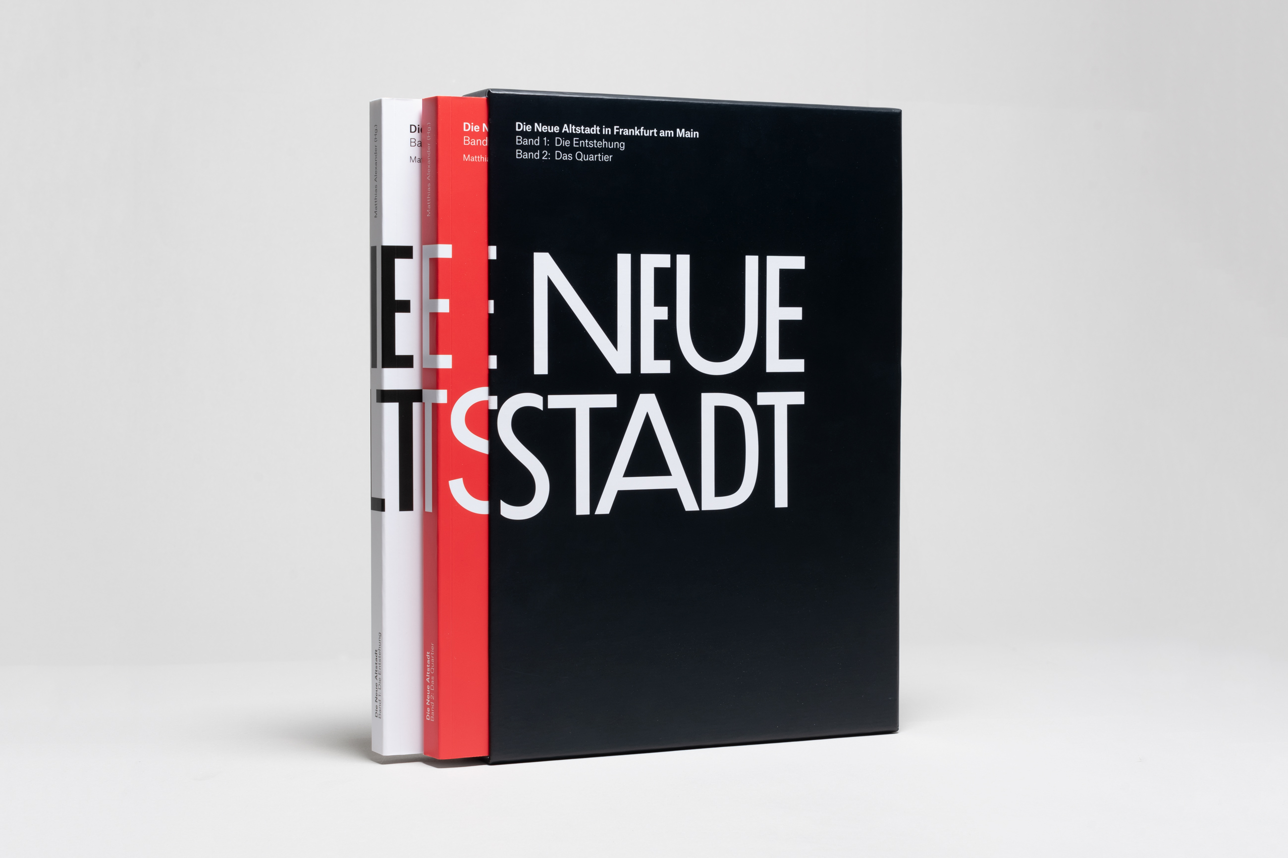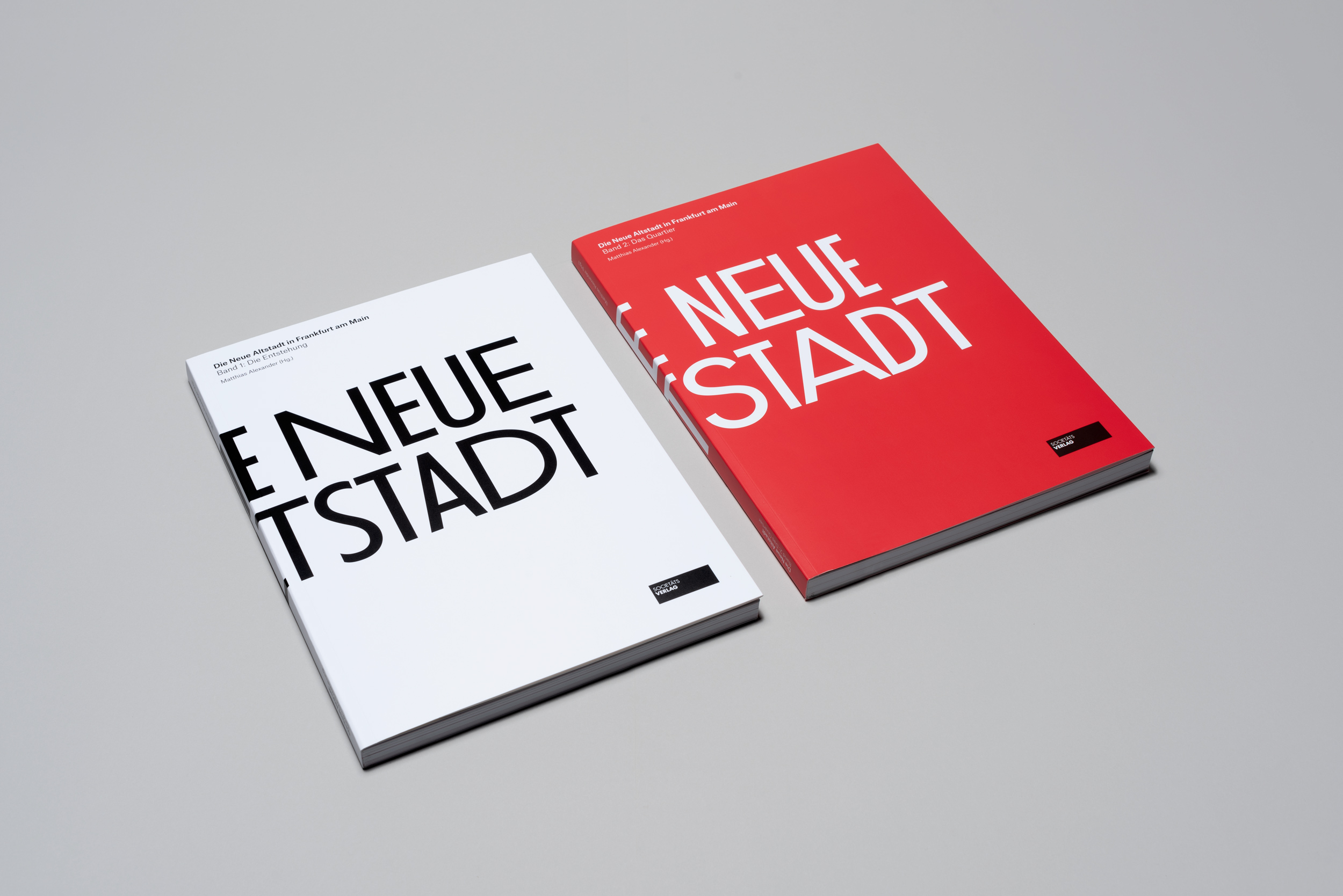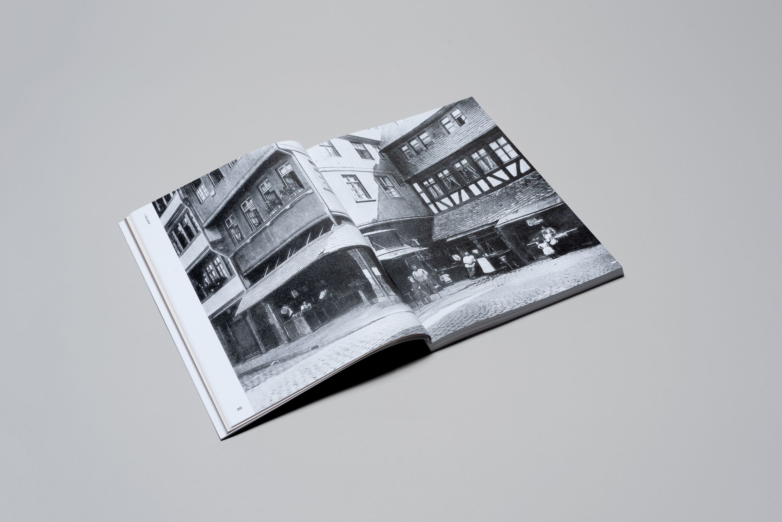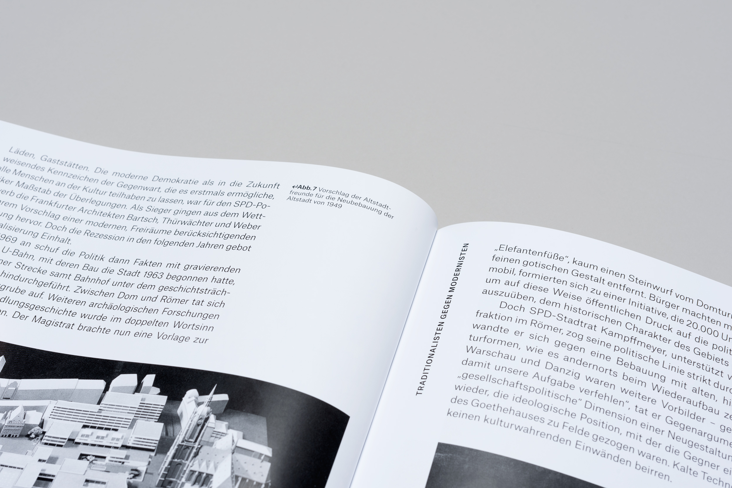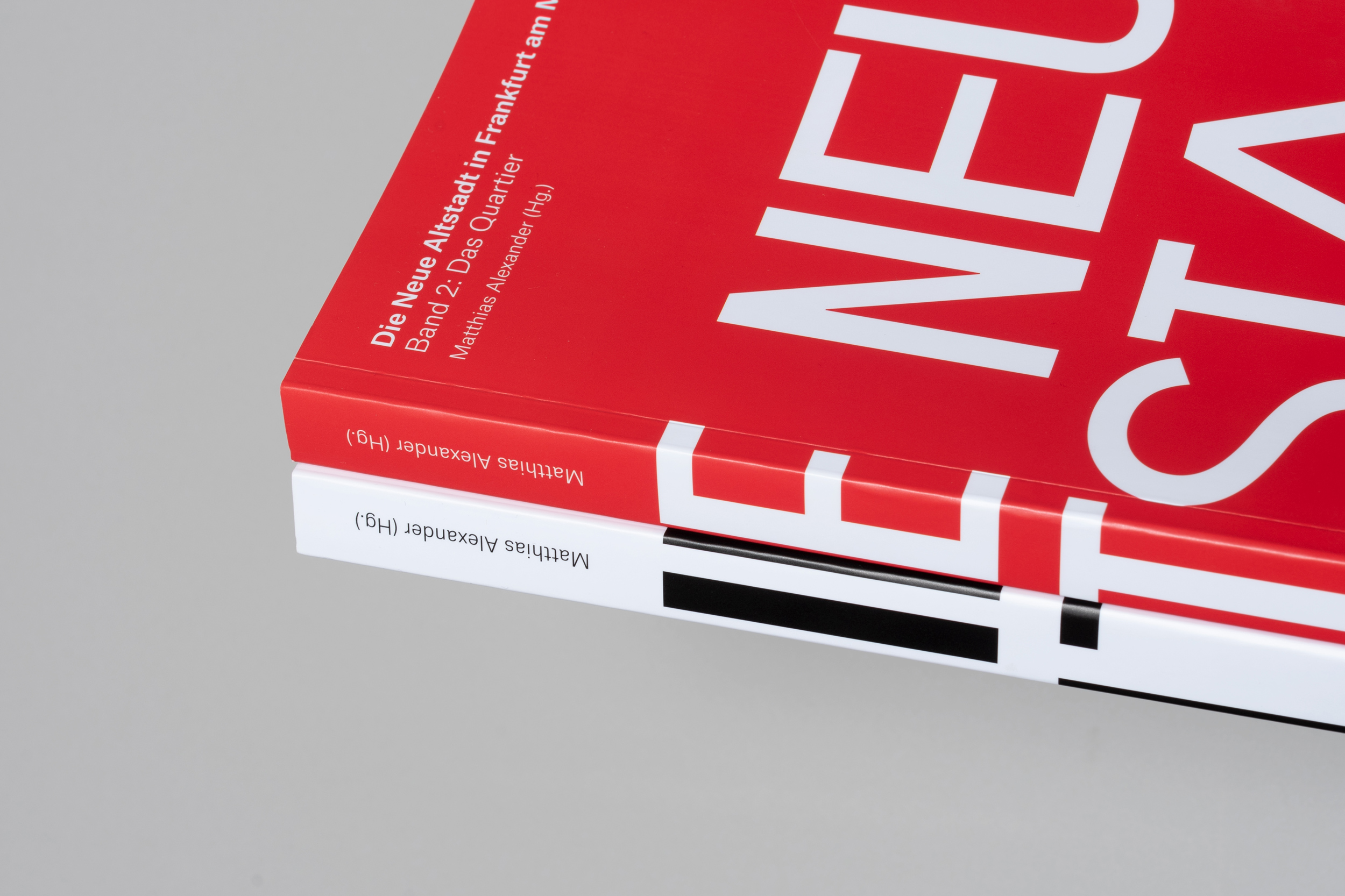
In the heart of Frankfurt Edited by Matthias Alexander, this two-volume book accompanies, documents and comments on the entire Old Town project from planning, political discussion to the start of construction, implementation and completion. The large format edition impresses with its elaborate layout and a large number of unpublished illustrations.
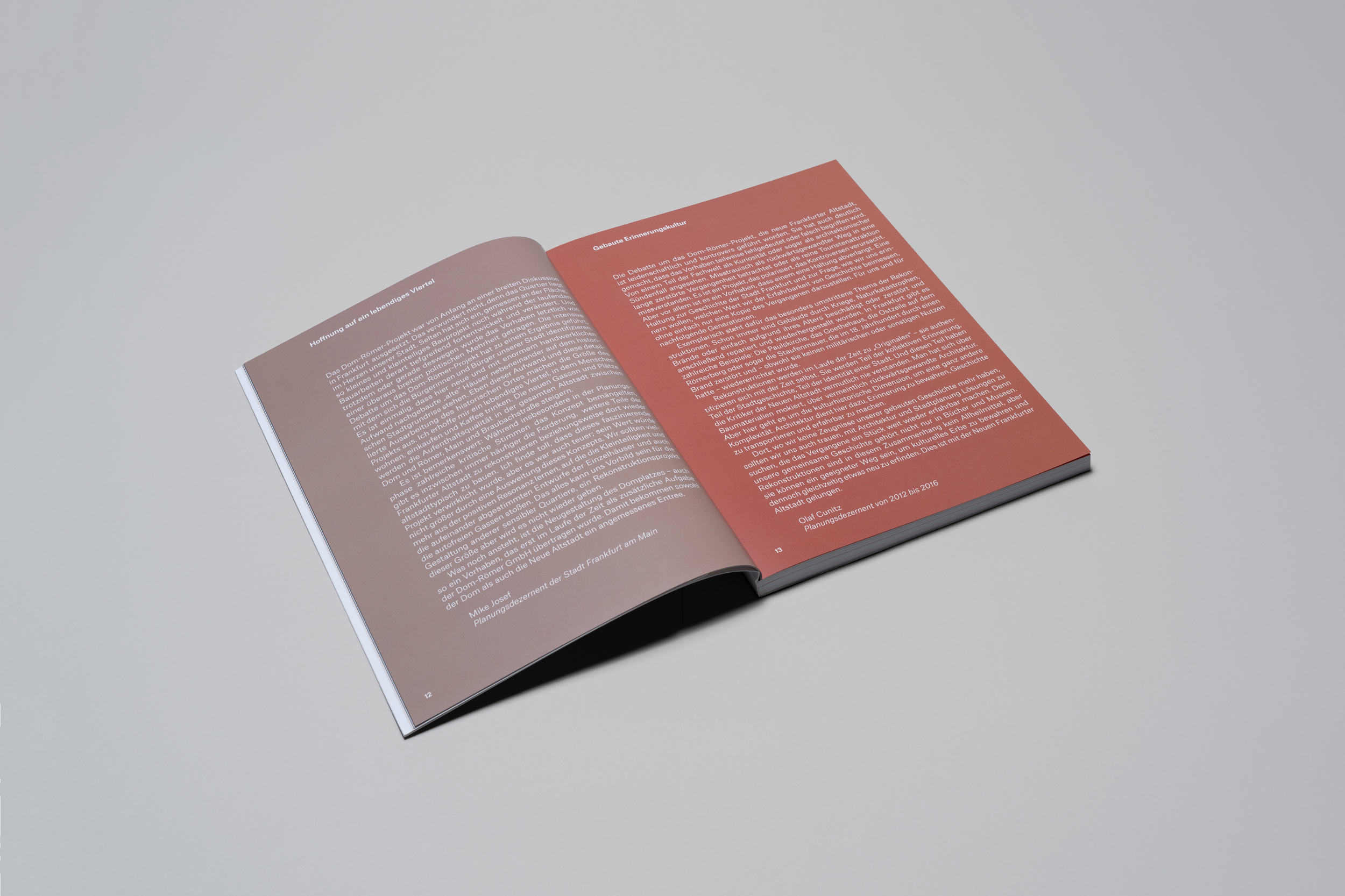
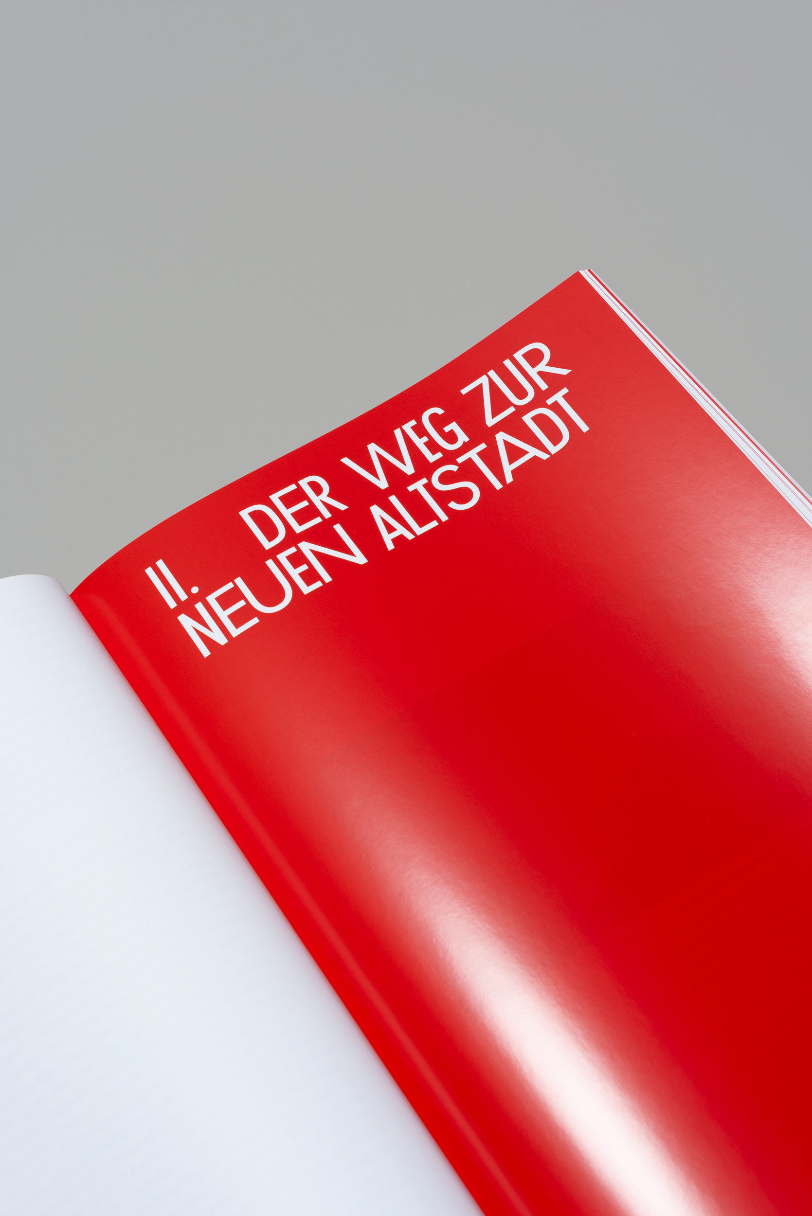
The graphic concept of the publication takes up architectural design principles of the New Old Town. Typography and grid translate the structure of houses of different widths, narrow streets and small squares and courtyards into the language of book design. This is reflected for example in the text columns of different widths, in the placement of the images and in the design of the elements used.
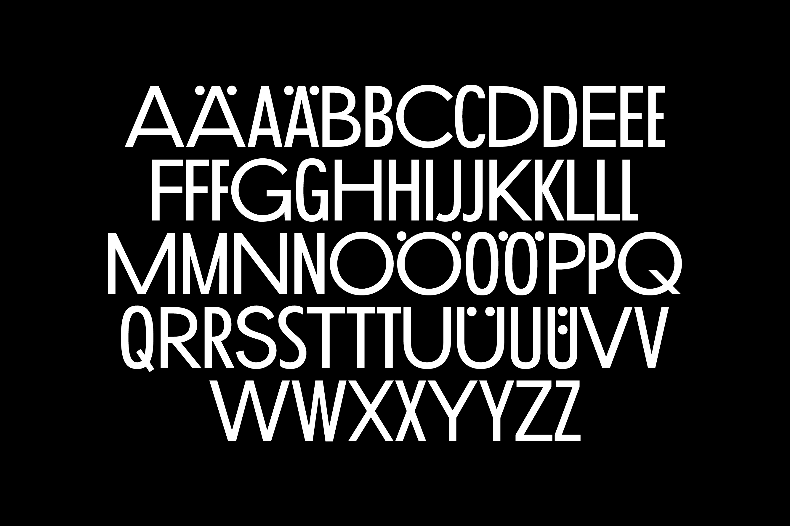
The typeface, which was specifically developed for the project, quotes the graphic language of Ernst May’s journal Das neue Frankfurt, which appeared from 1926 to 1931. For the new font, capital letters—based on the Futura—were designed in different widths. The color scheme of the two volumes is also inspired from buildings of the New Old Town.
PROJECT
Die Neue Altstadt (in Frankfurt am Main)
YEAR
2018
TYPE
Bookdesign
CREDITS
With Markus Weisbeck, Surfacegrafik
